It’s been proven that consumers make decisions based on their emotions. The job of a good designer is to understand what the emotions are that drive your unique audience’s purchasing decisions, and how to visually convey those emotions. That message often starts with a logo. This is the first thing someone sees when they interact with your brand. (To clarify, a logo and a brand are not the same thing—a logo is just one component of a brand, which should include a whole visual library of things like photography style, illustrations, iconography, UI design, etc.).
Creating a logo for your brand is a combination of formulaic science and inspired creativity. This list is by no means exhaustive, but it provides an overall guide on how to begin a logo design, minus the extra sprinkle of human touch and brain power.
Step 1: Understand your Brand
Before you even think about going to the drawing board, it’s important to completely understand what the business is all about. Some questions you can ask are:
- Is it a tech company?
- A lifestyle clothing brand?
- Is it Business to Business? Business to Consumer?
- Where do they see themselves in five years? Ten?
By the time you’re done with your research, you should comprehend the company and its goals better than the CEO. (Maybe I’m exaggerating a little bit, but the point is—DO YOUR RESEARCH.)
For example, say you’re redesigning a logo for a new health food grocery store chain. Some initial questions you could ask might be:
- What inspired you to start this brand? What is your brand story?
- Give us your elevator pitch. Why should someone choose your store as opposed to your competitors?
- How would you describe your ideal customer?
- Who are your competitors? What do you believe they are doing right? What do you think they are doing wrong?
The answers to these questions and more will inform every creative decision you make moving forward.
Step 2: Define your Message
Using all the research you have gathered, start to determine how you want your audience to feel when they think about your brand. Do you want to evoke feelings of strength and athleticism, or trust and security? Maybe you want to communicate a sense of youth and energy, or authority and legacy. Whatever you determine, defining a clear brand message and story will help you choose the right visual elements for your brand.
Step 3: Identify Shapes + Symbols
One of the greatest tools in the designer’s pocket is the effective use of signs and symbols. The brain recognizes shapes and their meaning much faster than it can read, if the symbols are familiar. Designers can use these symbols to their advantage, by conveying a feeling or message using only a single shape, or a combination of shapes. In the figure below, all text and color has been removed, but the symbols still retain their meaning.
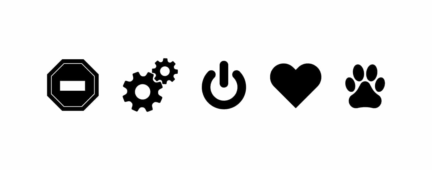
Even basic shapes like circles, squares and lines contain an incredible amount of information that can communicate very effectively. Generally speaking, squares and rectangles represent stability, maturity and order, because of their perfect, predictable angles and lines. By contrast, circles and ovals communicate a feeling of warmth and friendliness due to their soft, rounded edges and infinite beginning to end cycle. Triangles can represent dynamism, because they have diagonal lines which communicate motion or directionality (think the end of an arrow).
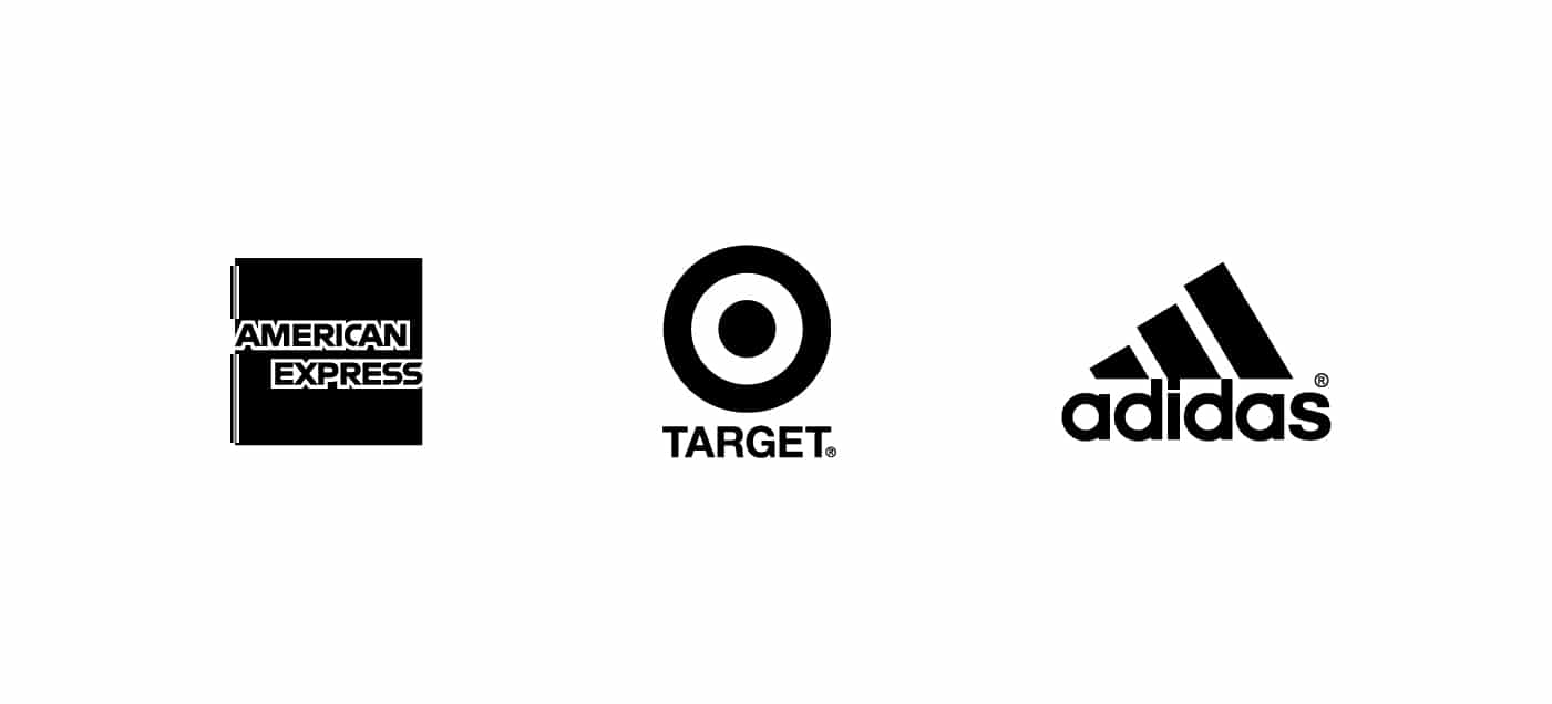
In the figure above, notice how each logo is composed of a basic shape – square, circle, or triangle (I’ve removed color so your brain can focus solely on the shapes themselves). Each of these shapes make sense for the brand they represent.
American Express wants to make people feel safe and secure, so customers will trust them with their money.
Target is a more relatable brand to the average working consumer, and therefore intends to communicate inclusivity, warmth and approachability.
Adidas on the other hand, chose a triangle to represent their logo to evoke a sense of motion, movement, and forward growth (notice the stepping up of each bar, which combine to form an overall triangle).
What shapes and symbols are relevant to your brand? Maybe it’s a tech security company, so you could utilize a lock or key. Or a landscape architecture firm, represented by organic, natural shapes and lines. Keep these shapes in mind as we explore how to apply them to your logo.
The visual grammar of shapes and symbols is an entire science, and we’re only scratching the surface here. Be sure to inform your creative decisions thoroughly and do your research by understanding what basic shapes you will choose to make up your logo, and why.
Step 4: Choose the right typeface(s)
There are two main classifications of typefaces: Serif and Sans Serif. “Sans” means without, so the distinction is whether the letters have serifs, or not. But what is a serif? They’re the little feet attached to each letterform – see below:
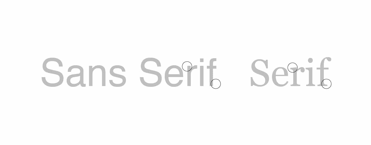
Sans Serif typefaces have only existed since 1816, and have only widely been used since the 1900’s. Therefore, they have a much more modern, youthful connotation. Think technological, sleek, and innovative. Their lack of decorative elements in the form of serifs make them practical and clean.
By contrast, Serif typefaces evoke feelings of tradition, heritage, and authority. They can also symbolize grandeur or embellishment.
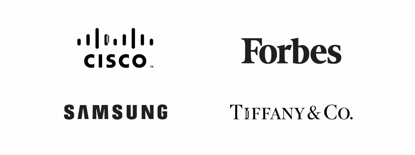
In the figure above, notice that Cisco and Samsung both employ San Serif typefaces in their logos. Both businesses deal with technology and innovation, and want to be seen as modern and inventive.
Tiffany & Co., on the other hand, is a jewelry company known for a longstanding tradition of quality. It makes sense that they chose a Serif to represent decorativeness and legacy. Similarly, Forbes sets itself apart as a reputable news source by using a Serif to communicate authority and intelligence.
Thinking back to our research, ask yourself what overall message you are trying to convey. Are you trying to communicate trust and technology? Maybe choose a blocky, rectangular Sans Serif like DIN. If you want your brand to be more approachable and friendly, a bubbly and rounded typeface like Quicksand could do the trick. A school that has a longstanding legacy and heritage might choose an old-style Serif to represent their brand. In choosing the right typeface, be sure to reference resources on typefaces.
Step 5: Choose relevant brand colors
Choosing brand colors that represent your message is just as important and complex as choosing the correct shapes and typography. Certain colors evoke specific feelings, which can vary by culture. Researchers have been able to assess the emotional responses to each color pretty universally.
Since this article is not 1,000 pages long, we will skip to analyze just one as an example. The most common, and sometimes the safest color choice, is blue. Within blue, there is a huge variety ranging from turquoise to navy to aquamarine to royal. Either end and every hue in between has a slightly different connotation. In general, lighter blues inspire feelings of calm, trust and healing, whereas deeper blues can communicate a sense of confidence and professionalism. See below:
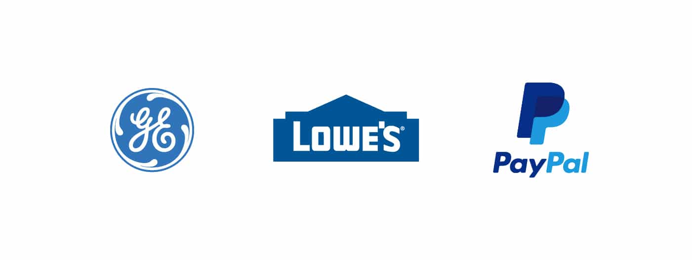
By choosing blue as their core colors, all of these brands–GE, Lowe’s, and PayPal–are effectively letting their audiences know that they are trustworthy, reliable, and professional in their fields. This makes their potential customers more inclined to use their services.
Step 6: Gestalt
Gestalt? Did someone sneeze? No, Gestalt is actually a school of thought coined in Germany during the early 1900s, that still influences how designers convey meaning to this day. You can review Gestalt Theory in more detail here.
In logo design, Gestalt explains how our brains process complex shapes and relate groupings of objects, creating a whole picture out of several components. One of the most popular Gestalt applications is using figure-ground relationships and positive and negative space to define a given symbol. By using Gestalt, designers can create more memorable and clever logo designs; like these:
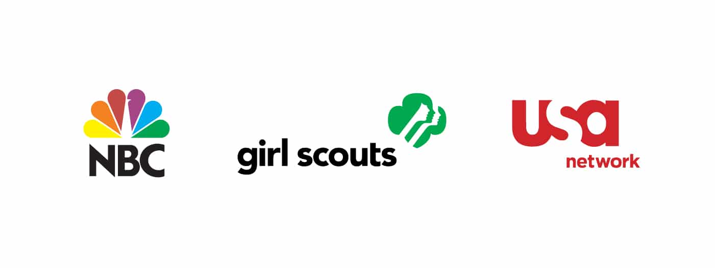
Notice how in all three of these designs, the positive shapes join together to outline a negative shape.
- The body and head of the peacock is defined by the edges of its feathers in the NBC logo.
- In the Girl Scouts logo, each girls’ face layers on top of each other in alternative positive/negative. Gestalt predicts how our brains will naturally complete the whole outline to see a clover shape, in addition to the faces within it.
- The “s” in usa is defined by the shapes adjoined with the “u” and “a”.
Tying it all together to create an effective brand
Now that you understand the formula to determine shapes, colors, typefaces, and form, the final (and not always so straightforward) step is to add all of these carefully chosen elements together to create a successful logo.
As a designer, my first try at a new branding project is almost never the final result, and my art boards always become scattered with numerous different thoughts, ideas and attempts. Be persistent, and don’t settle for your first attempt, because the most obvious solution is probably not the most creative or memorable one. Experiment, experiment, and experiment again. You never know when that inspired moment of creativity will hit!
If you want to learn more about how we create effective and inspiring brands at OGK, check out some of our work!


